APPLE PODCASTS: Adding a Feature
Get the Right Content at the Right Time.
Design a new Apple Podcast experience made for a user's unique lifestyle.
The Beginning
For a school project, I was tasked with adding a feature to an existing product. I decided on Apple Podcasts, something I use every day, but (not proud to admit as a UX person) I never took much time to break down the user experience. I was there for the content which, for me, created a feeling of an individualized experience.
After doing research I found that regular Apple Podcast users do not feel that the user experience is individualized. They feel confused, overwhelmed and that the app does not know them. How might I make a well-established product more personalized?
Overview
The Challenge
The “regular” Apple Podcast user feels overwhelmed and confused when finding their content. The challenge here was to find a way to eliminate those feelings for users and help them get to what they want quicker.
The Solution
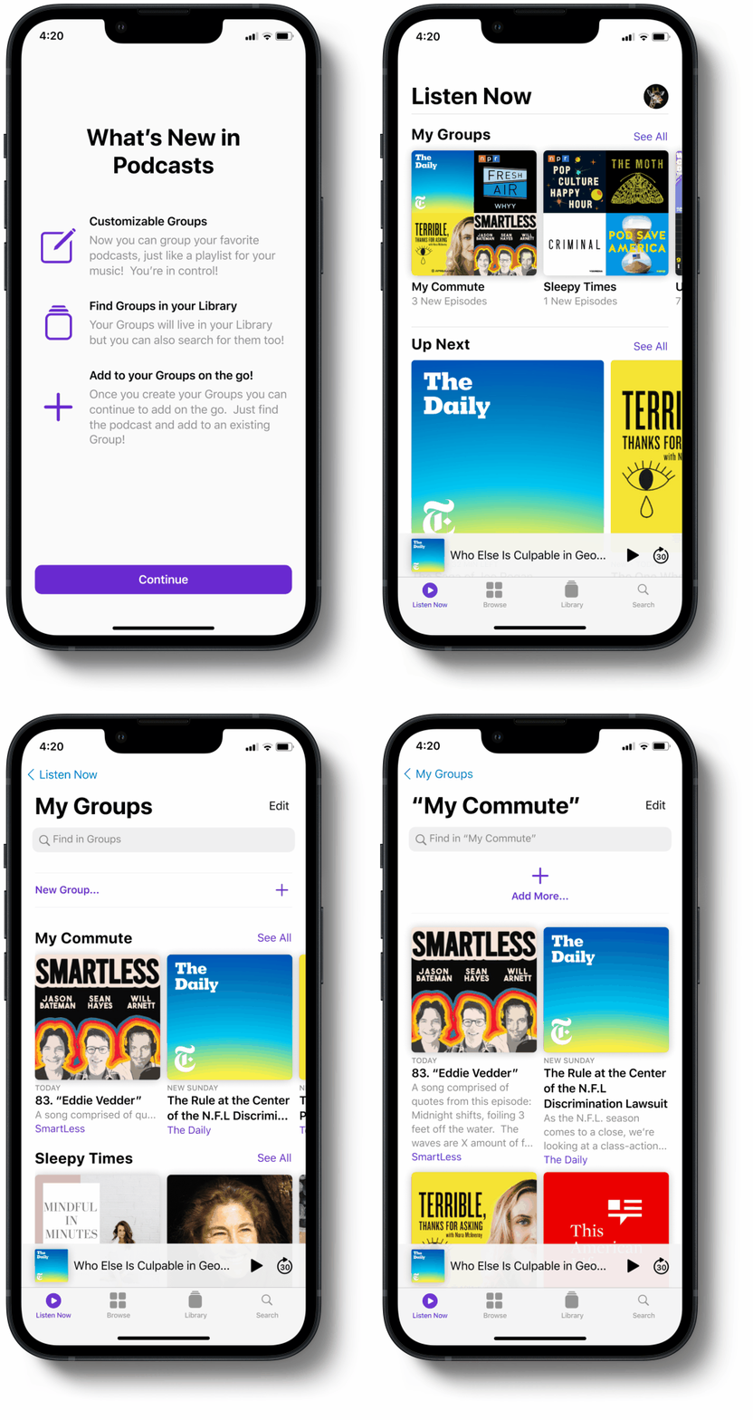
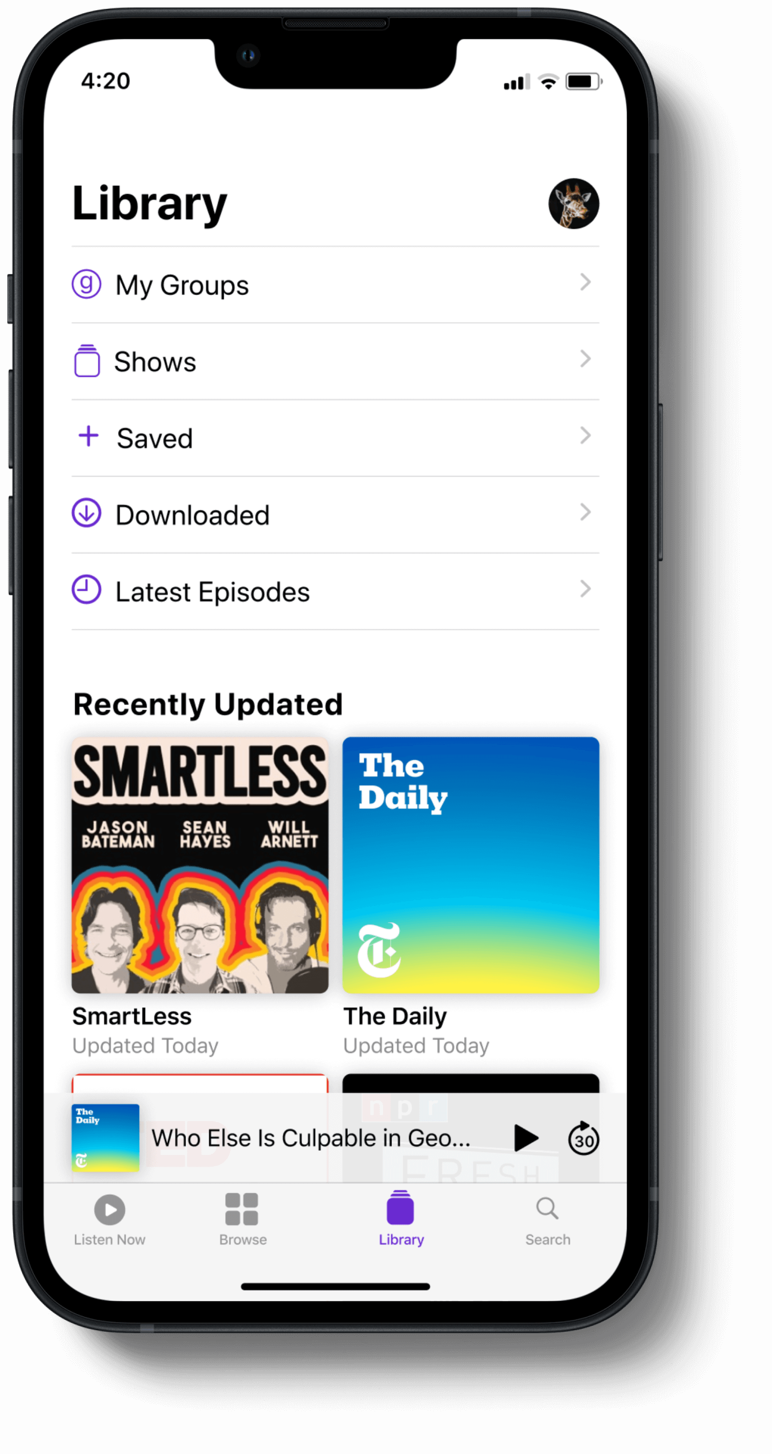
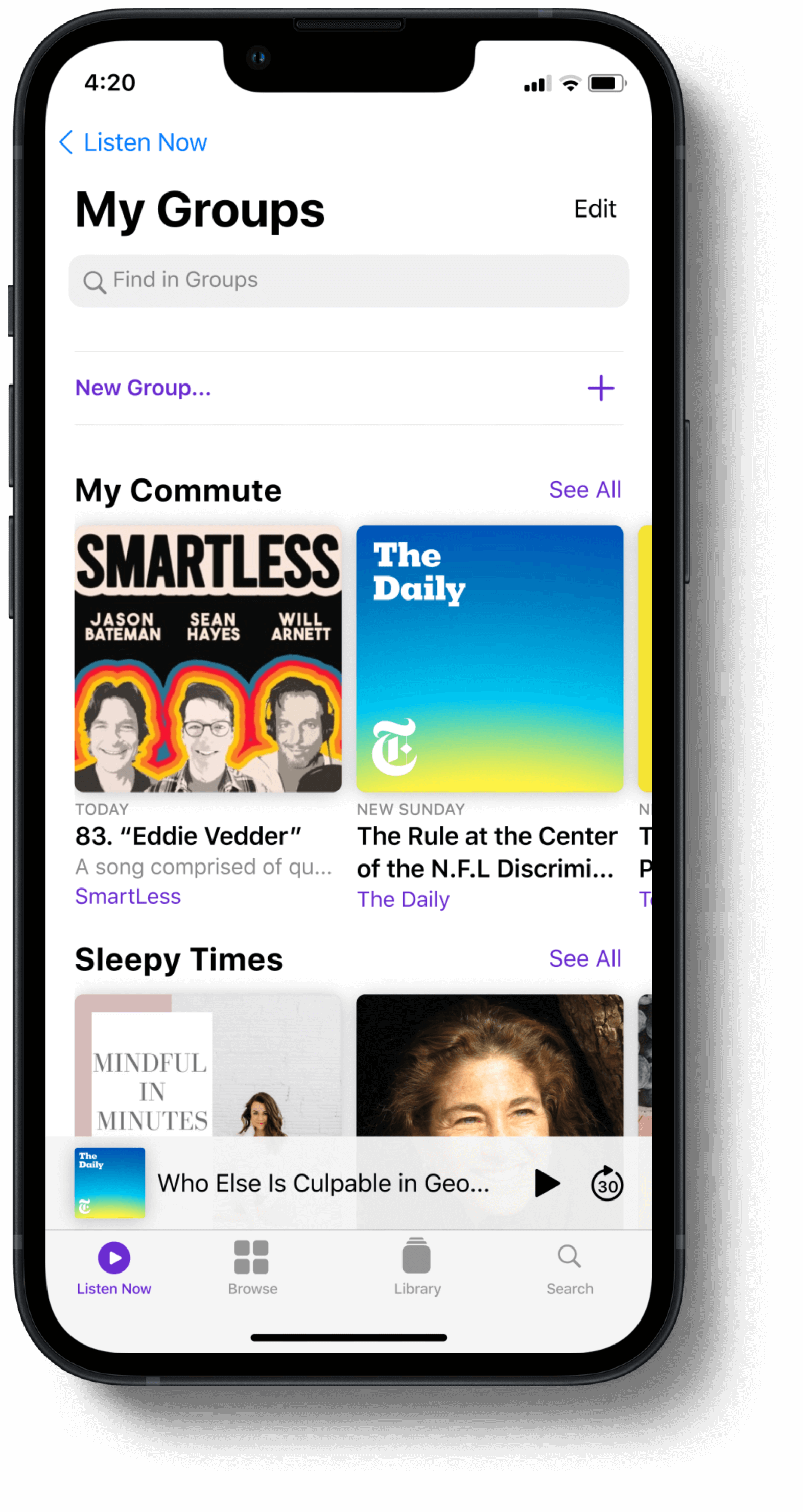
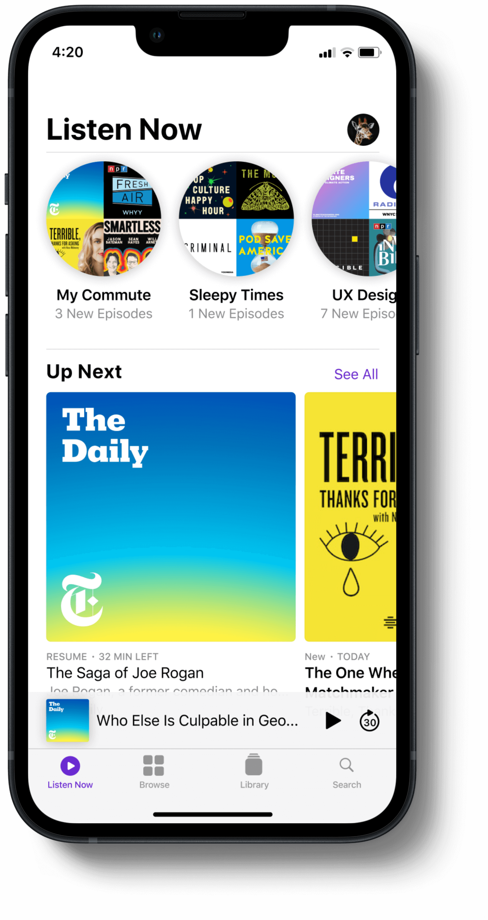
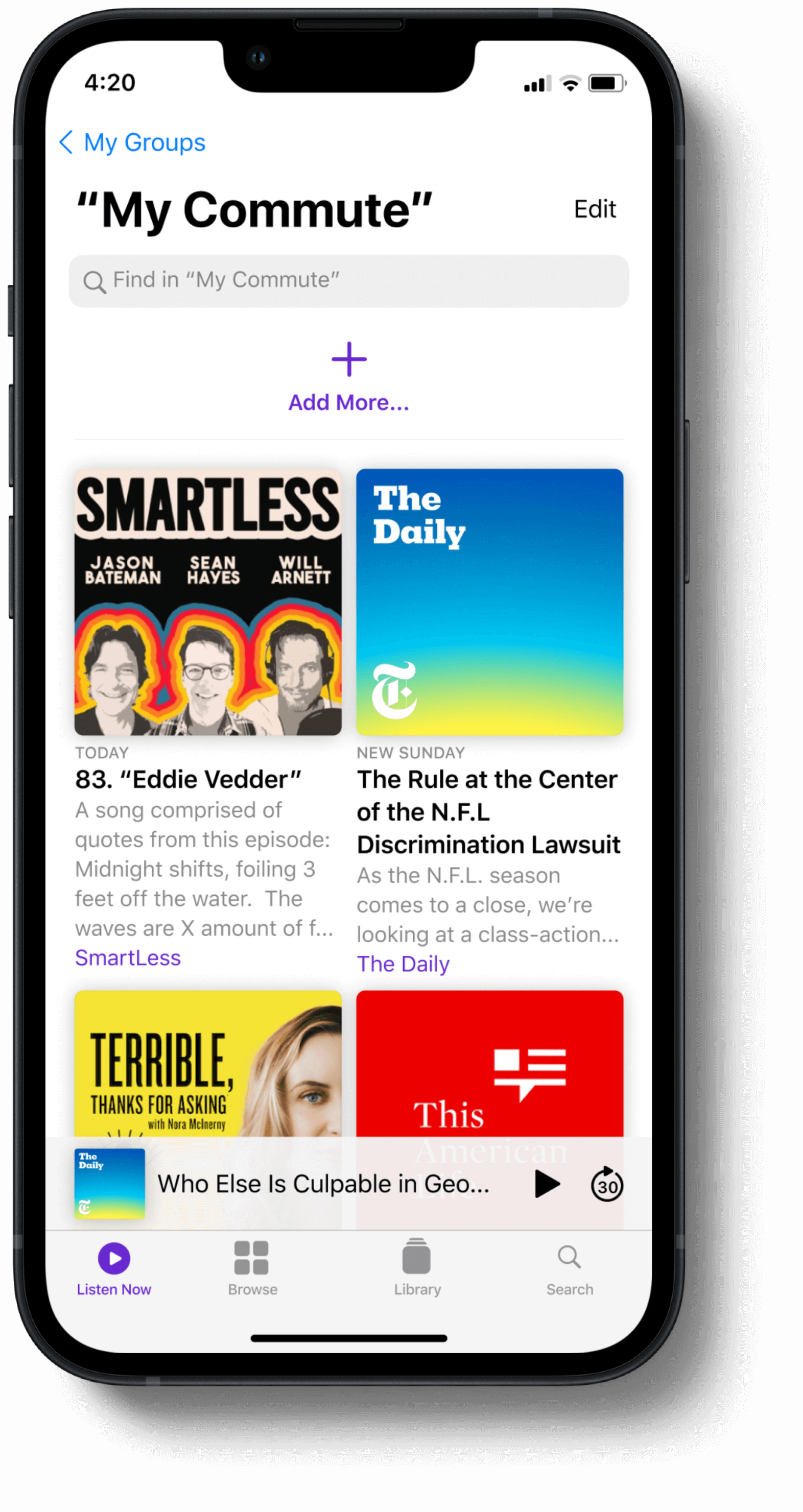
Add a feature called “Groups” that allows users to create their own personalized playlists by adding series and/or episodes to self-titled “Groups”.
*This project was completed as part of DesignLab’s UX Academy program. This project will not be implemented.
The Process
I used the Double Diamond approach for this project and spent most of my time defining the problem, designing solutions, testing those solutions, and designing more.
Within the discovery phase, I gathered a lot of information which gave space to come up with a lot of solutions. Defining a focused problem was key due to the scope of the project, and took some time. Once I landed on the direction, I started designing and testing early to validate the idea.
01. DISCOVER
Understanding who apple podcast users are, their goals & pains.
There are tons of podcasts and podcast listeners. Truly. They come in all shapes and sizes. The regular users listen … a lot. And, they subscribe to a lot.
Choosing a specific user was important to be able to define a problem and create a solution. My attention was focused on the regular everyday user because of the recurring theme in reviews expressing frustration from this group.
What is being missed? Where is this group being forgotten?
Focusing on why users are there rather than likes + dislikes.
I interviewed (5) users that were all regular podcast listeners.
My goal was to understand why the user was there in the first place and then curate a design around that rather than focusing on what they like and don't like.
“Anytime I am trying to listen to a podcast I always know what I want and what I am looking for. Not enough time in the day and podcasts aren’t short enough like music where you can have the app randomly play things for you”.
“I tend to listen to the shows I have subscribed to for years. I rarely seek out new shows to listen to.”
“I first open up the app, then get confused because the app opens up to the “Listen Now” page, which doesn’t include a list of my most listened to shows”
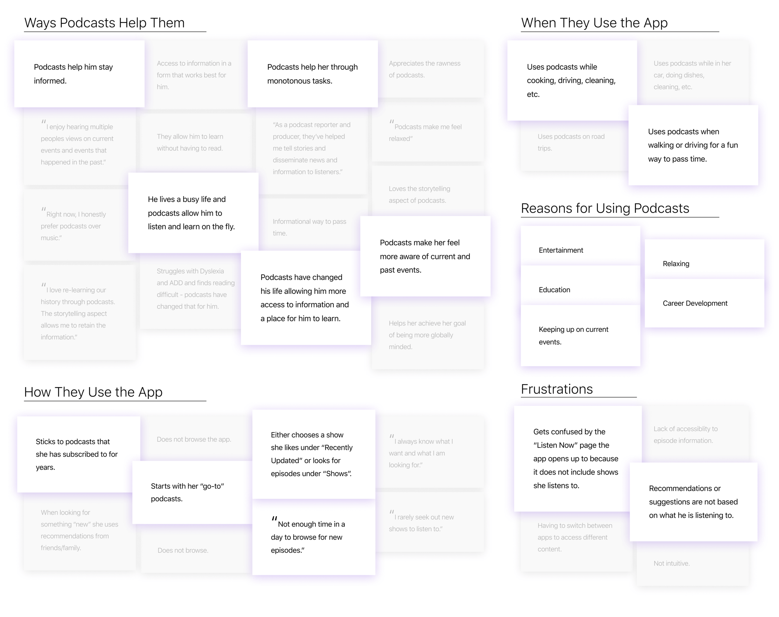
TAKEAWAYS: User Interviews
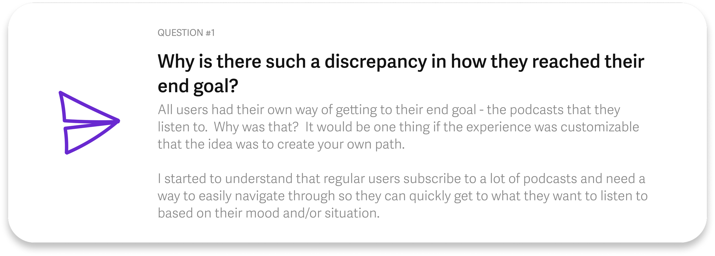
QUESTION: User Interviews
“There is no clear path for the regular user to access “their” content and users are frustrated.
Regular users need a clear process. We also need to keep in mind that even regular users have different reasons for being there and that personalization is key.”
How do competitors support their regular users?
There was an underlying theme in the user interviews of confusion and frustration on where to go to find their “go-to” content - each had come up with their own way of getting there. The goal of this competitive analysis was to figure out how to help regular users with that issue.
This process supported me in taking a divergent look at solutions, but it didn’t bring me to the finish line. Narrowing in on the specific problem was necessary to be able to move forward.
02. DEFINE
Customization is the way to support the entire group, including subgroups.
In the process of defining the problem, I wanted to make sure I was including the subgroups of the “Regular User” group. Because of that, I made two personas: (1) was open to the idea of browsing, and (2) was not.
I wanted to remind myself that the subgroups exist so when designing solutions I would make sure they were not too narrow that they didn’t support the entire group. Including customization throughout was a way to support those subgroups and I wanted to make sure that was included in the solution.
The user wants to be in the driver's seat for their experience.
The customer journey map helped me pinpoint where the users were running into their problems. Prior to this process, I understood that users were feeling confused, but where exactly was that happening? This is when the convergent thinking started.
Yes, organization was an issue, but for the scope of this project, it needed to be more defined. I was not asked to redesign but add.
TAKEAWAYS: Defining Problem
How Might We…
HOW MIGHT WE #1
offer a space within the app for users to create their own personalized experience to access their preferred content?
HOW MIGHT WE #2
reduce the cognitive load required when going through their task and flow?
HOW MIGHT WE #3
make the experience of finding “their content” more accessible and intuitive for regular users?
And we did it, we defined the problem. Let’s make playlists!
The daily podcast user needs a clear way to organize and find their podcasts to lessen their cognitive load so they can continue to educate and better themselves.
03. DESIGN
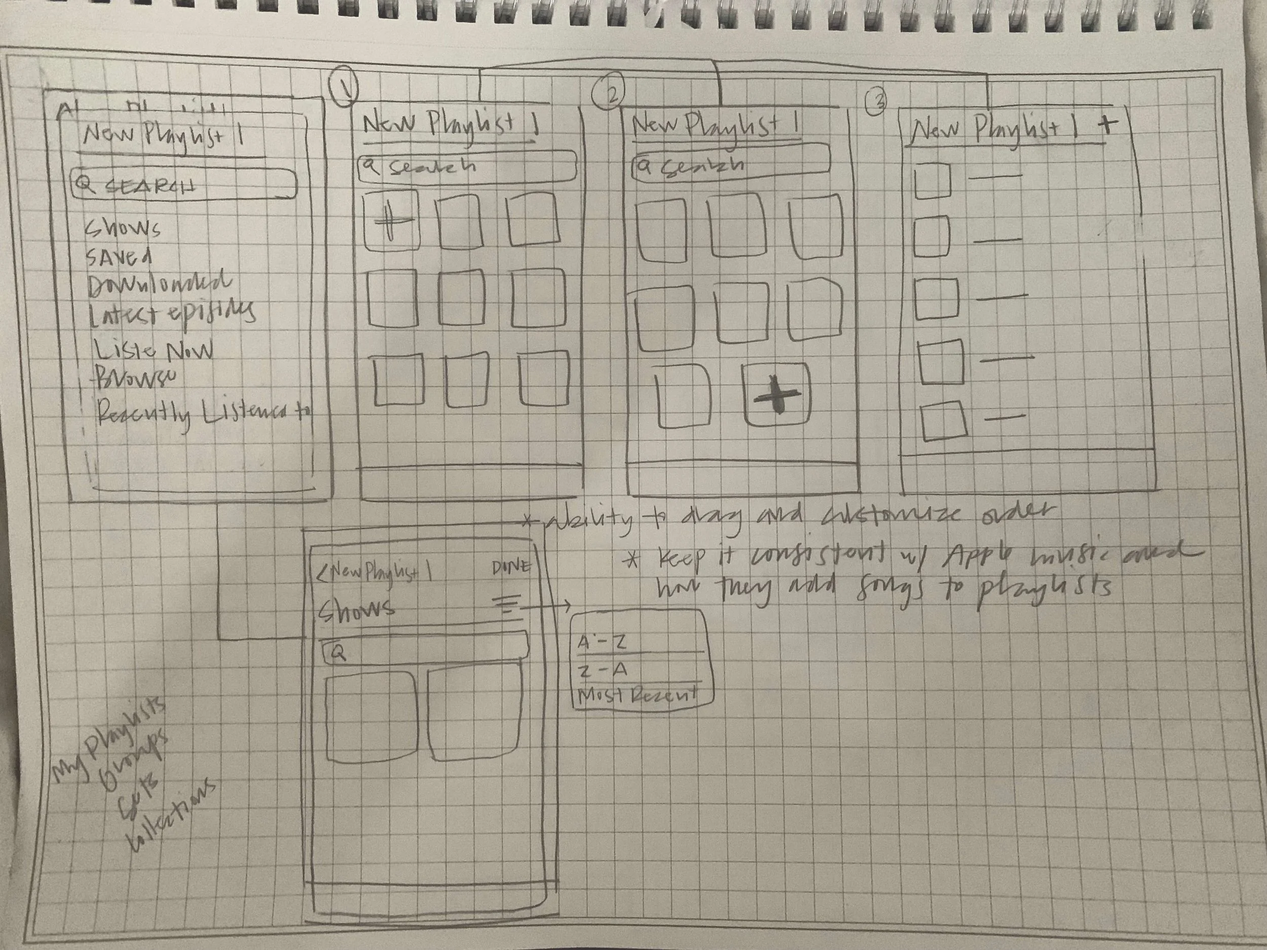
Getting ideas on paper. But also following what has already been created.
Having defined the problem, now it was to the drawing board. Although this should be a time of exploring possible solutions, I decided to try to stay in line with other Apple products, like Apple Music. I based much of the layout on their playlists.
The goal of this project was to lessen the user’s cognitive load so I felt it was defeating the purpose to create something that was completely different visually. I felt it was more important to get users used to the idea of playlists in Apple Podcasts. Enhancing the UX/UI of the feature could be done in a future release and possibly in tandem with Apple Music.
(This is under the assumption that users who use Apple Music also use Apple Podcasts for their podcast listening, but further research would need to be done to confirm this.)
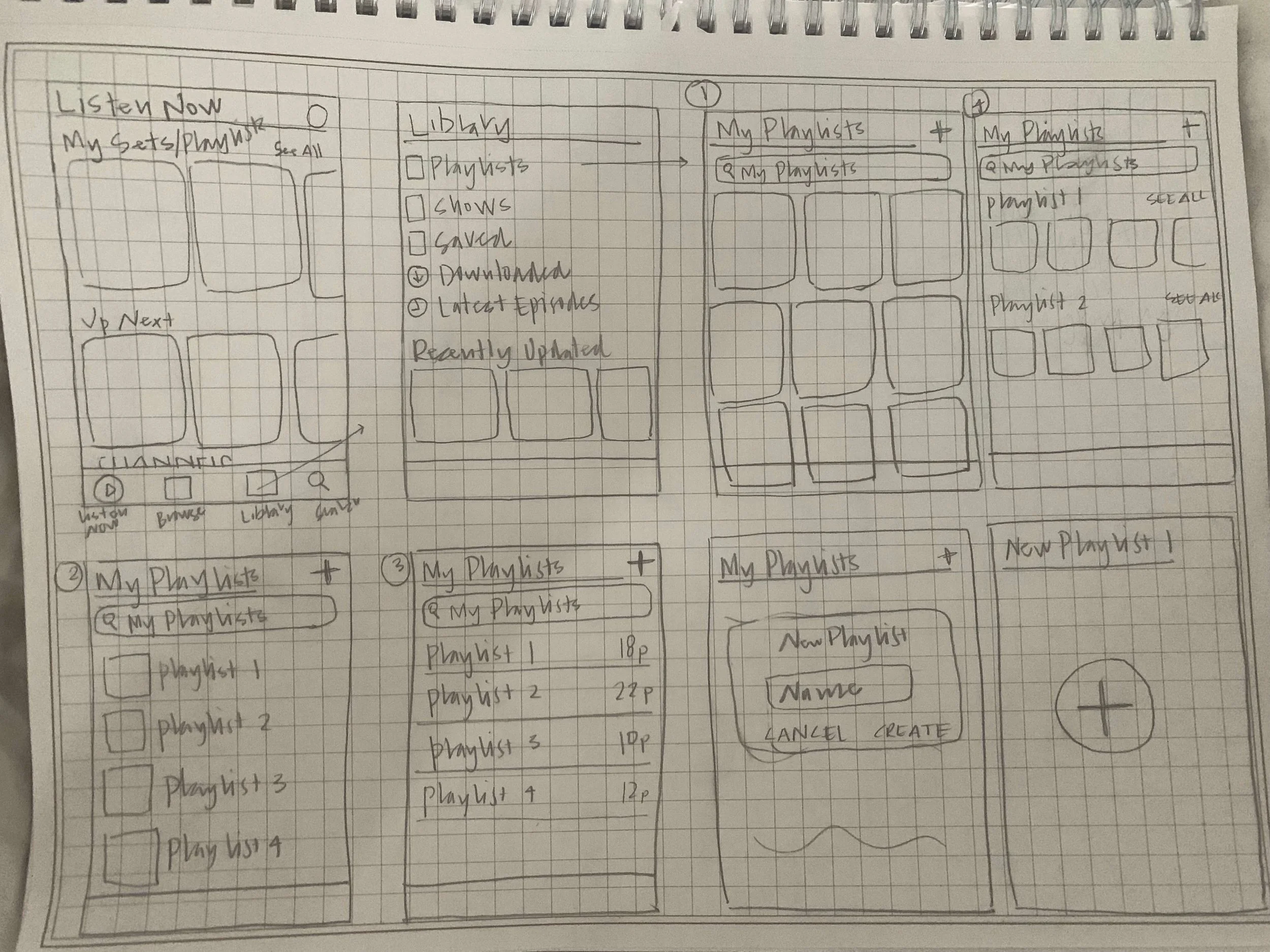
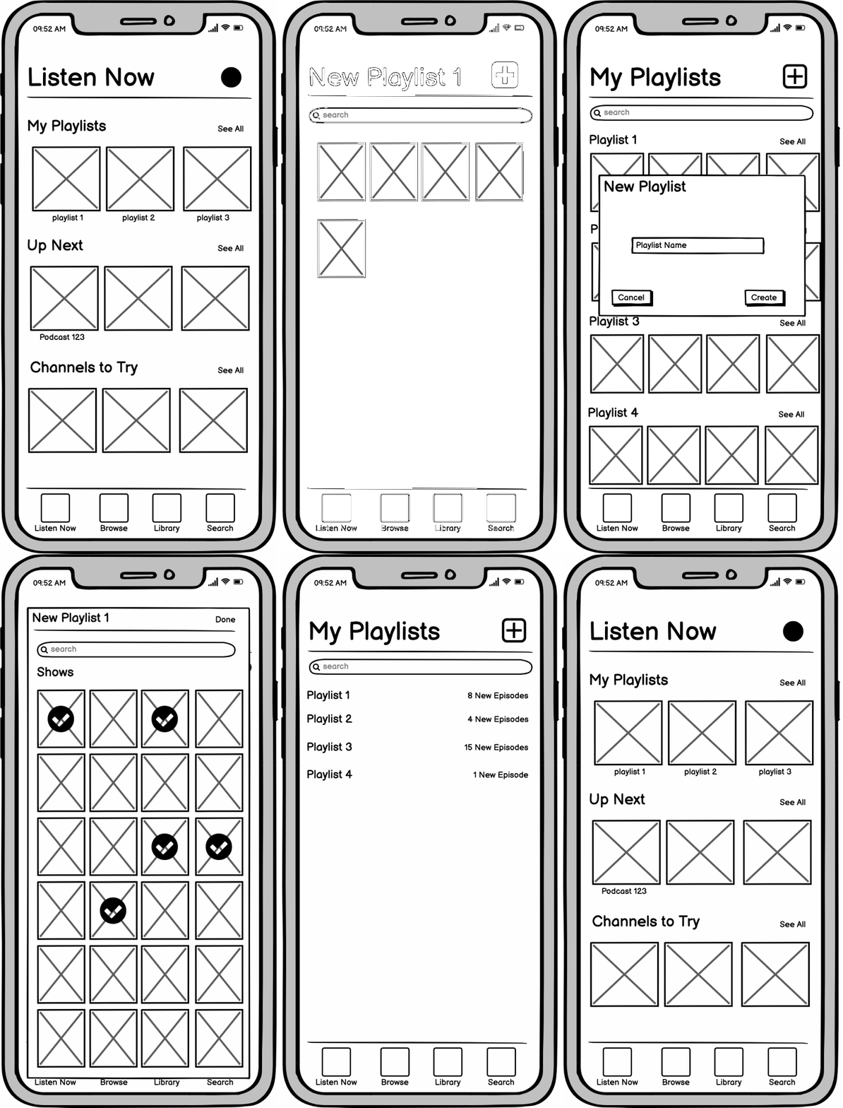
Testing early to validate - is this what the user wants? What are “Groups”?
I made lofi wireframes and tested early on to see if the solution of “Groups” was something that users would use. I wanted to test and see if the concept worked in action, including the name.
Half of the group were Apple Podcast users and half were not. I wanted to include non-users as well to make sure the concept was easy to understand across the board.
“Having the playlists cuts through the searching process and brings you right there.”
“I like that my playlists are at the top. Normally you get bombarded w/ suggestions but with this it’s something you created.”
“Once I did it once I knew would remember how to do it again.”
“The flow and location of things align with other entertainment apps which is helpful”
TAKEAWAYS: Rapid Wireframing
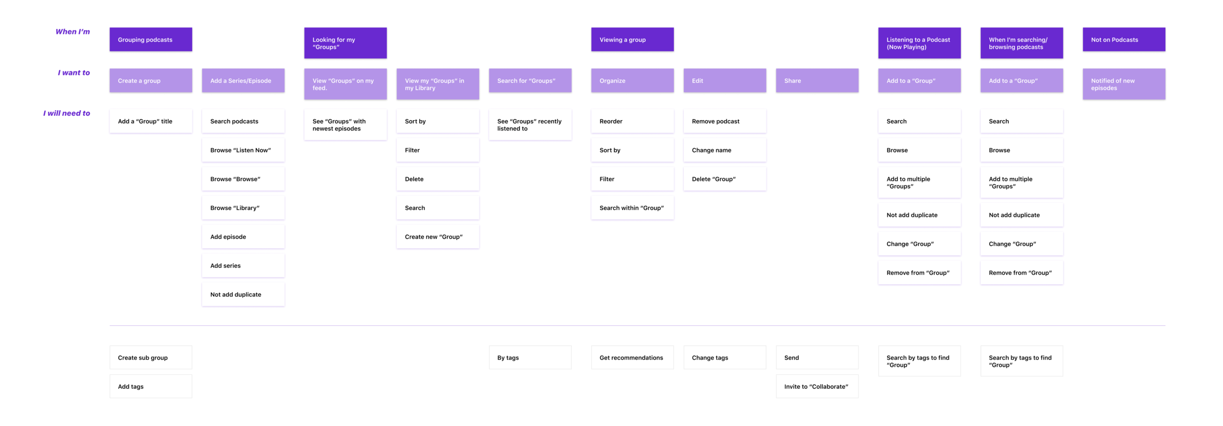
Mapping to figure out what’s needed where, and how the capabilities are all connected.
This process allowed me to take my user stories and map out what specific features/capabilities/additions would be needed to achieve the user’s goal.
This process helped me get a holistic overview of where things needed to be. It set me up to be able to then determine what pages would need to be created. It turned ideas and concepts into tangible next steps.
Although due to time constraints, I wasn’t able to design most of the capabilities on the map in my prototype, it set me up for the future of the product and next steps/releases.
Did some mapping and now back to designing!
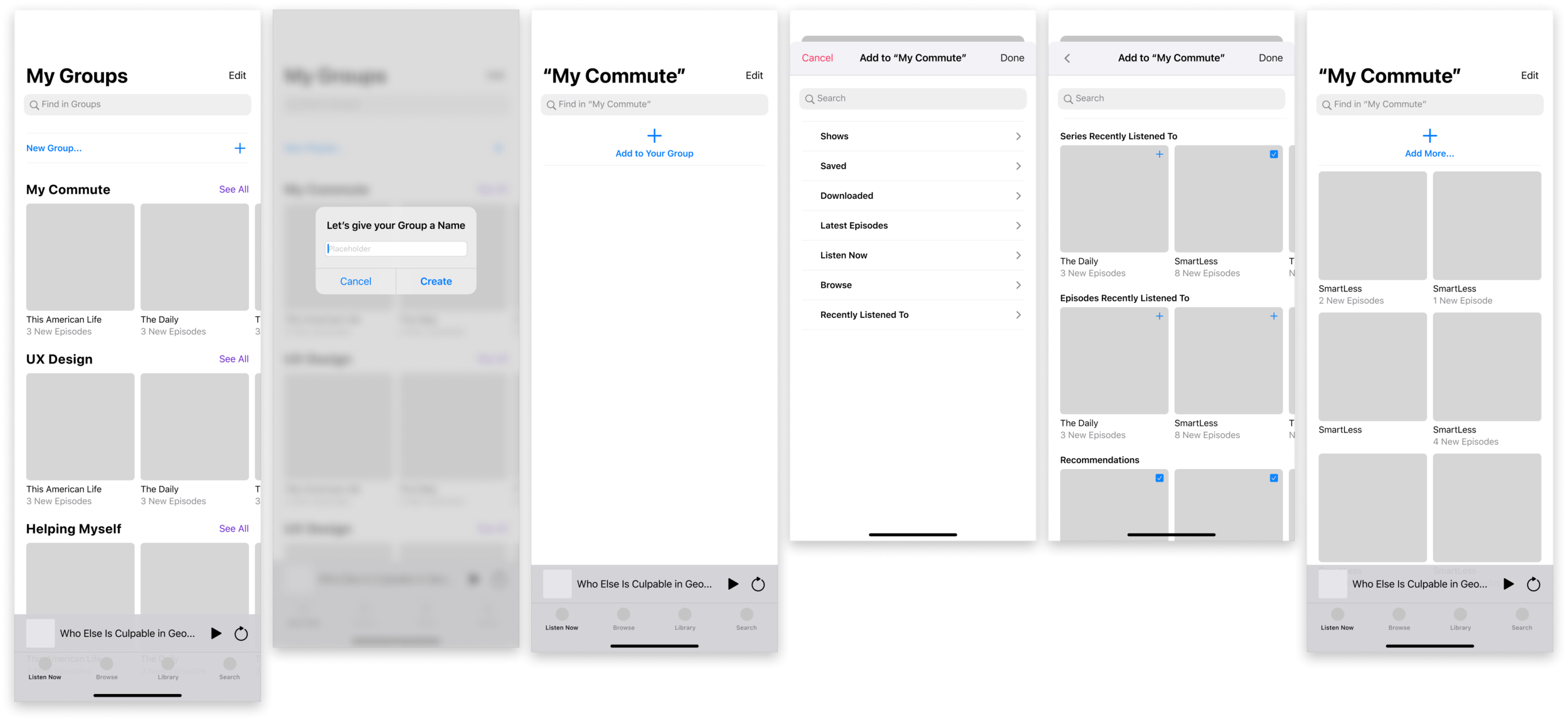
Having already done a wireframe test I decided to do high fidelity wireframes to start focusing on components that would be used.
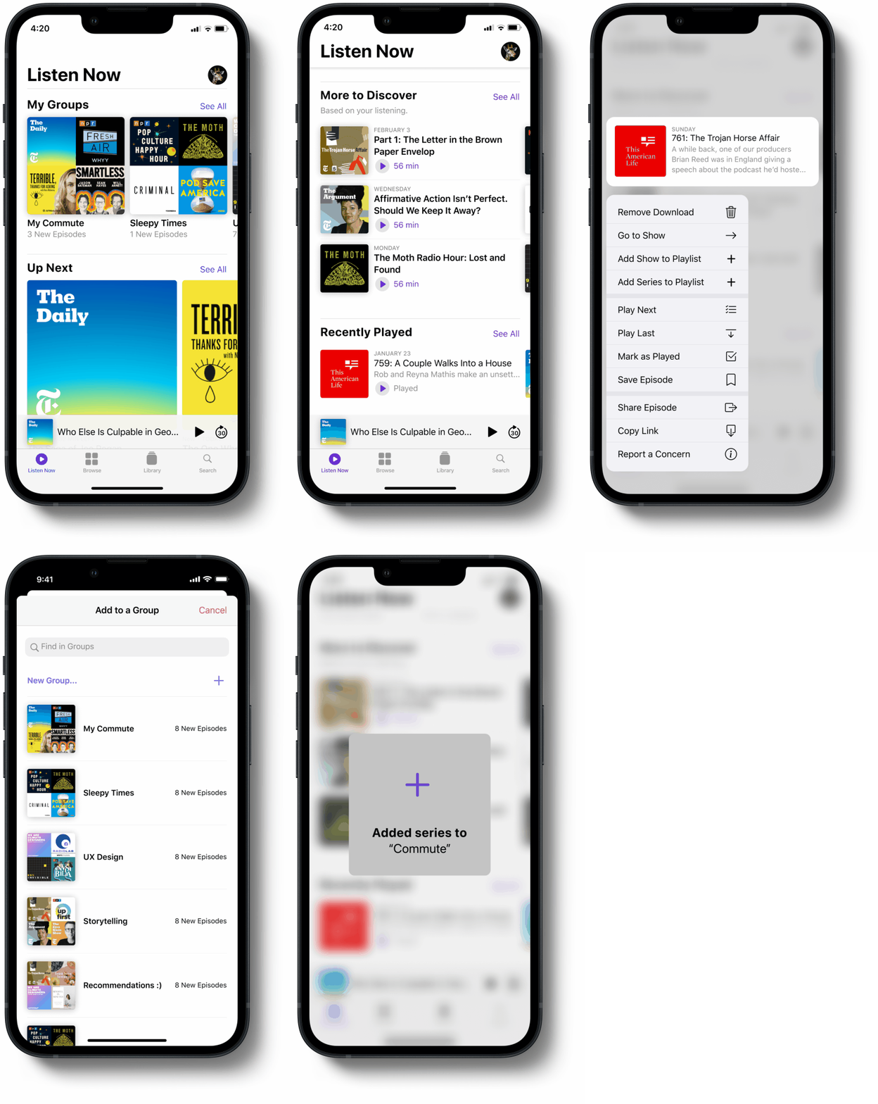
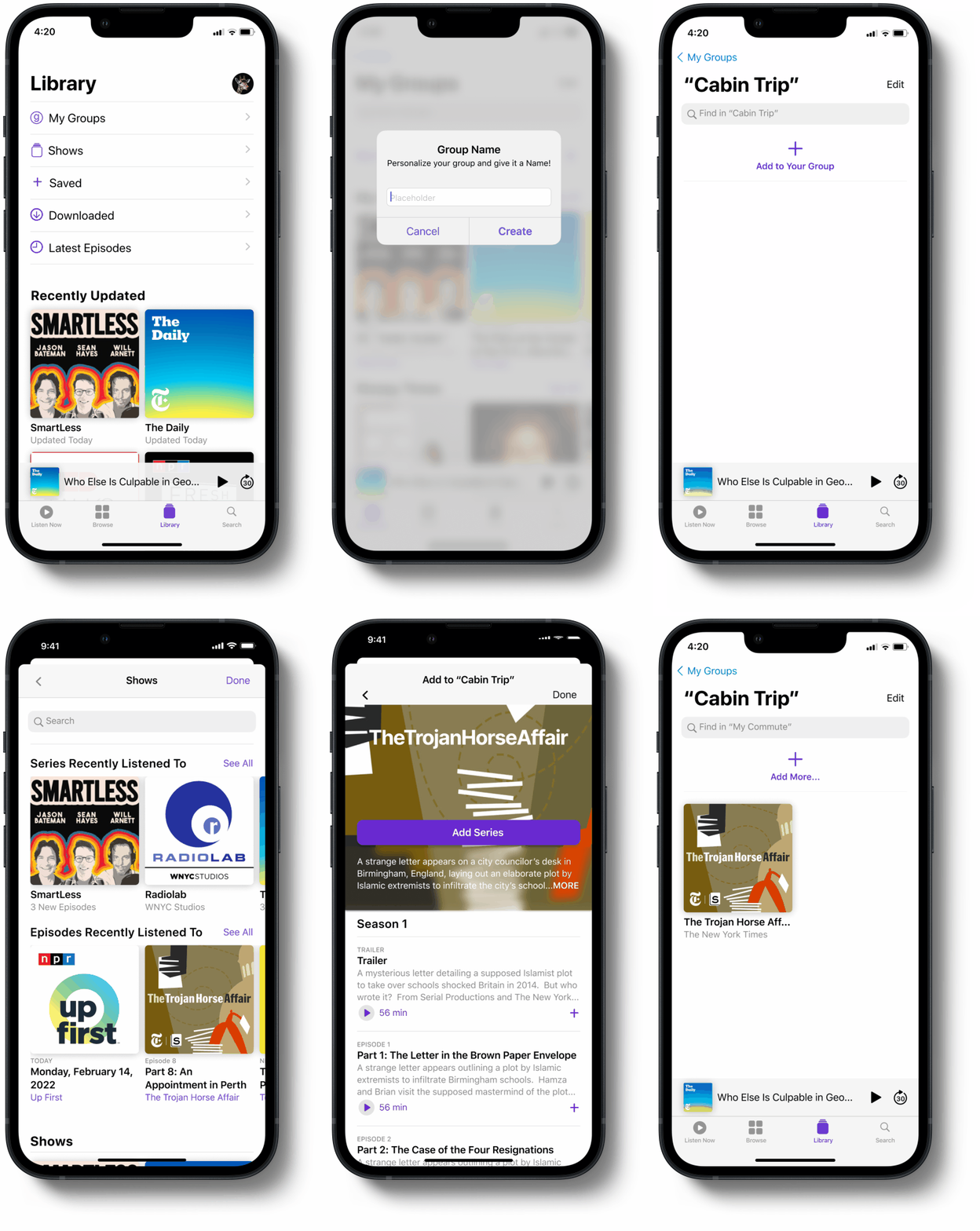
Determining which screens were necessary for an MVP was based on making sure that the feature was the aspect being spotlighted so I felt I needed to showcase how to create a “Group”, add to a “Group”, and find “Groups”.
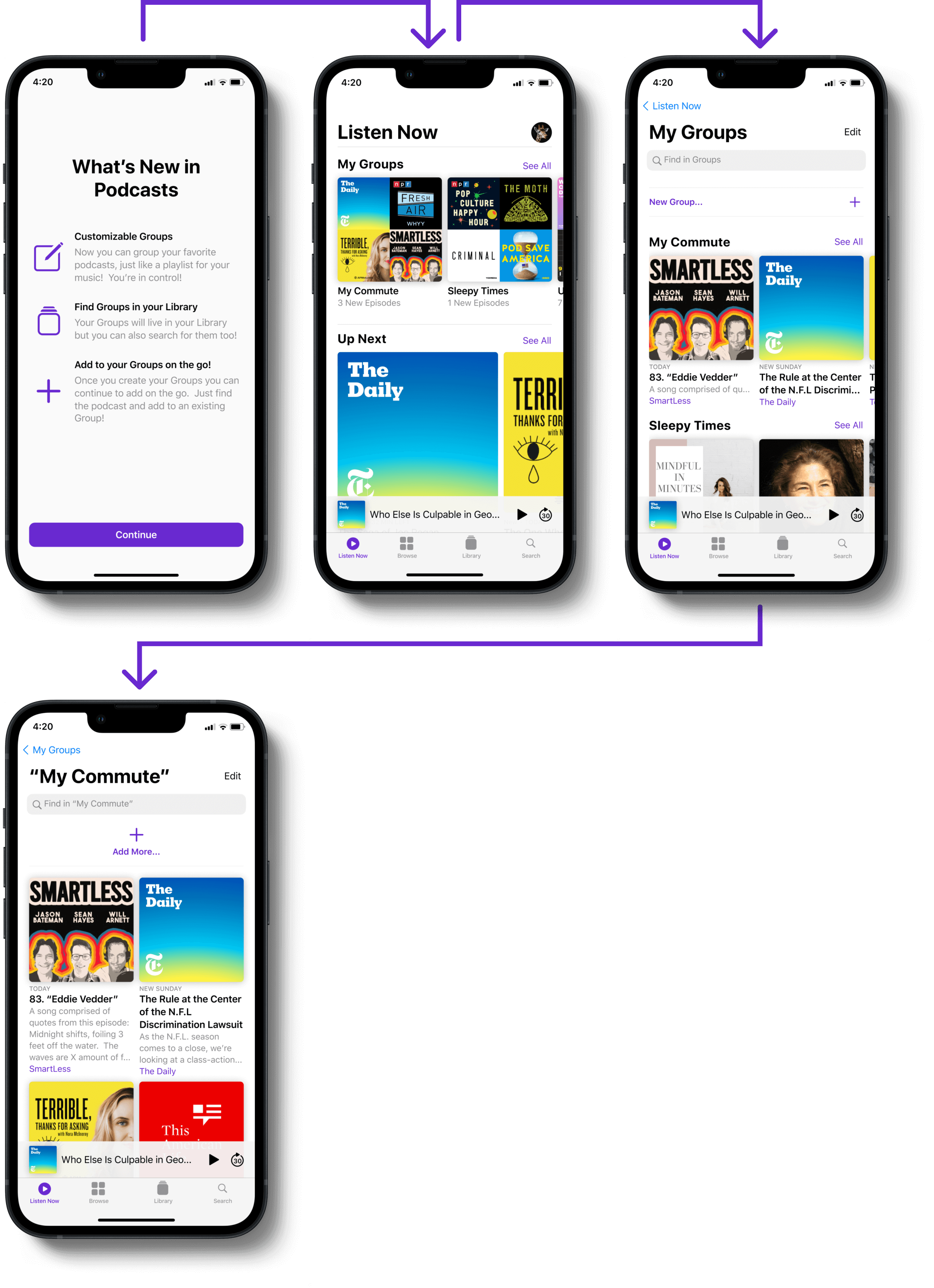
I used the Human Interface Guidelines from iOS to mimic their onboarding. Lessening cognitive load for the user was the main goal within this project so matching products was important. Iterations on areas can come later on after users are familiar with the new feature.
04. DELIVER
Focusing on UI to match the existing product
Based on my User Research, I found that users were wanting to get to the series that they listen to faster. Because of that, I wanted to allow easy access to those throughout their process. I wanted to avoid forcing the user to have to click into multiple different pages to get to their “go-to” series.
FLOW #1
Flow #2
FLOW #3
What do the regular users think?
I ran (5) usability tests with regular podcast users and my goals were:
GOAL #1
Are they able to complete the tasks and easily navigate the new feature?
GOAL #2
Is the content presented in a way that lessons their cognitive load and supports them in their flow?
GOAL #3
Assess usability focusing on Learnability, Efficiency and Satisfaction
TAKEAWAYS: Usability Testing
There were some changes made based on the user’s reviews.
Let’s pin “Groups” to the top!
BEFORE
AFTER
Breadcrumbs - creating constraints to guide the user to a better experience.
BEFORE
AFTER
Less is more
BEFORE
AFTER
Future testing and releases.
The ability to pin groups to the top of the “Listen Now” page is something that would need to be built out and tested. We would need to see if users feel that it allows them easy access while keeping the cognitive load at a minimum.
I believe that there needs to be further testing on the IA and how the user flows through the new feature. Specifically focusing on the breadcrumbs.
Because the solution to this problem was customizing their experience I would want to add in a tagging feature to allow for even further customization and even quicker navigation through the content.
The last future addition that came up during this process is to allow for collaboration and sharing capabilities. Again, customization is the backbone of this feature. How can we make a robust app with an immense amount of content feel unique to each individual? Making it feel like a space that is theirs and a space where they can collaborate with their friends and peers would enhance that.
Biggest Takeaway - Information Architecture
Reflecting back on this journey and process my biggest takeaway was that I wish I would have spent more time looking into the structure of information and labeling. Because I was working on an existing product I am realizing I spent more time focused on what the users had to say and what they wanted to make impactful changes.
The structure of already existing information (i.e. breadcrumbs) was a second thought to me because I thought that I could continue forward with the existing labeling and structure and it would work. It wasn’t until later on that I realized there were issues here that could have been fixed earlier on.
What I realized through this process was the importance of paying attention to the minor details in a specific flow and how they relate to the larger holistic experience of the product. Going through and testing the structure of information and labeling is the top priority for next steps.
This is definitely not the end and really feels like just the beginning.
This process helped me learn how to narrow in on specific problems to be able to focus on the users facing that problem and solve for them.
This project got my mind and ideas flowing and makes me wish I could continue moving forward with it and continue to better it. I want to know what the users think.


