KAUS INSURANCE: Responsive Ecommerce Design
Getting insurance in the hands of the user.
Design an ecommerce site that appeals to Kaus’ younger users.
The Beginning
I was tasked with designing a responsive e-commerce site for a hypothetical insurance company, Kaus. Times have changed - digital devices are everywhere and the internet is continuously expanding.
But today, KAUS is falling behind its competitors because of its lack of a direct to consumer options for their users, specifically for their younger demographics. My job was to create a design that allowed easy access to insurance for younger demographics.
Overview
The Challenge
KAUS is missing growth and sales opportunities with younger age groups looking for easy solutions to purchasing insurance online. The goal for this project is to create a design that is user-centered first and foremost.
The Solution
An ecommerce design that holds transparency and simplicity at the forefront using visuals to aid the user in moving forward in the process.
*This project was completed as part of DesignLab’s UX Academy program. This project will not be implemented.
The Process
Throughout this project, I spent a lot of my time in the problem space trying to understand the user and define the specific problem they were faced with. I designed a solution based on that.
My biggest insight though, came during testing when I realized I needed a better balance of user needs and business needs to create a truly user-centered design.
I spent the rest of my time redesigning solutions uncovered in testing.
01. DISCOVER
Understanding the user is the name of this game -what do they like and dislike?
Insurance is a complex industry for the average person and can be very overwhelming as a customer. The process can be daunting because of the number of types of insurance, the competitive prices, the number of companies offering insurance, and the confusing language used throughout the process.
Finding out what users like and dislike about their experiences buying insurance and better understanding the industry and the norms was the goal - how are other companies approaching this problem?
TAKEAWAYS: Competitive Analysis
Exploring design patterns to lessen cognitive load without sacraficing important product information.
When exploring the market to better understand the industry I focused on design patterns that work and solve the issues that users are faced with within the insurance setting.
I knew that users felt overwhelmed by the amount of content included (as well as the language used). I wanted to find solutions to lessen that feeling without eliminating important information. What is the best way to present this to the user?
NAVIGATION
CARDS
TAKEAWAYS: Design Patterns
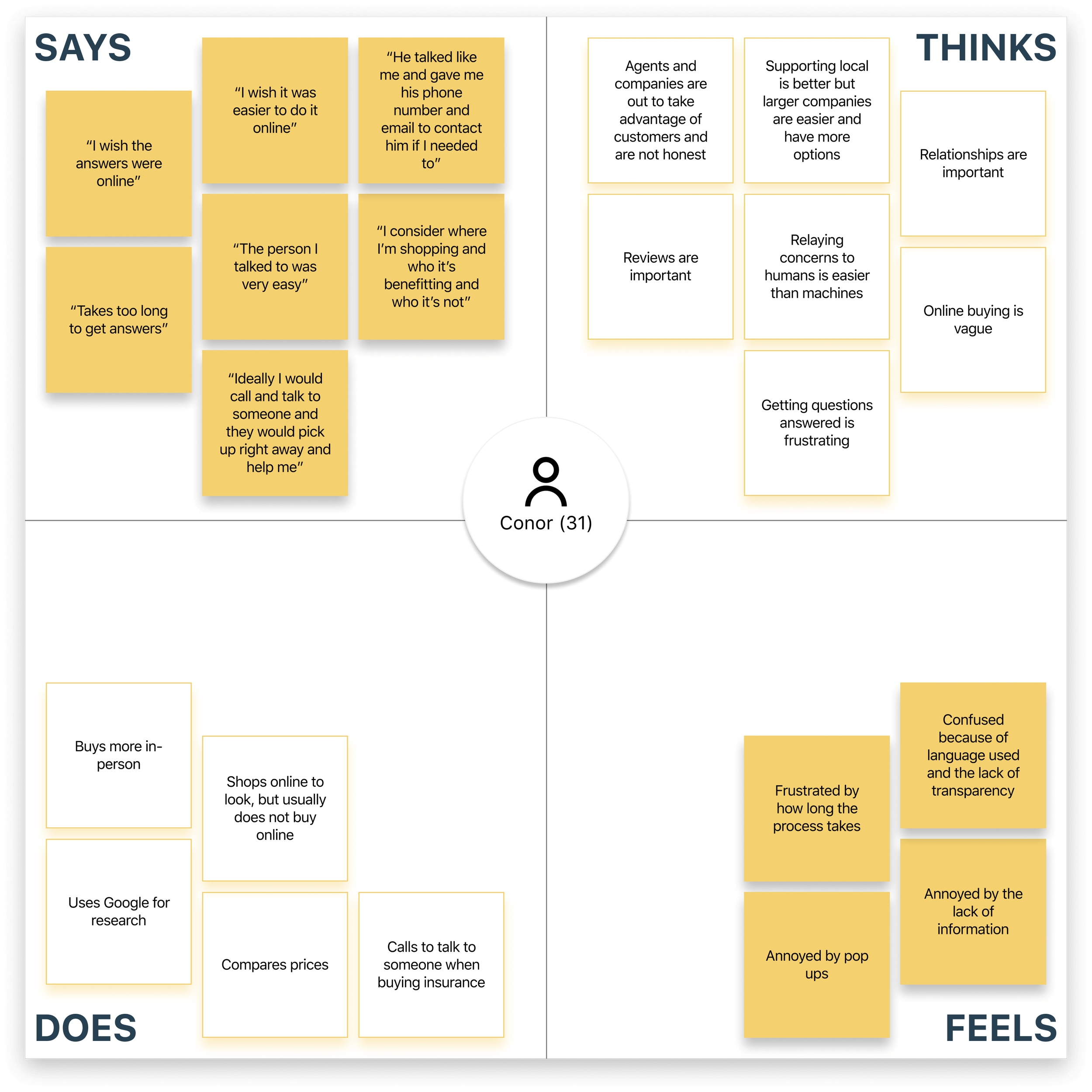
The goal was to find out what users value - transparency is what they want.
I interviewed 3 users ages 26 to 59.
The goal was to better understand what users value about insurance and how they go about making insurance decisions.
I was also curious about what factors influence a user’s online purchasing behaviors - what gets them there and what factors influence their decision.
TAKEAWAYS: User Interviews
“The lack of transparency in information, prices, and language creates distrust in users. They are looking for an experience that makes them feel confident + in control.”
02. DEFINE
She’s our user. Green to the insurance world.
This persona helped me make sure I was designing for those who have a minimal understanding of purchasing insurance. Because the target audience for the business is younger demographics, I wanted to make sure the design supported them as they are.
How Might We…
HOW MIGHT WE #1
make a design that is browsable and easily scannable?
HOW MIGHT WE #2
make transparency start from the beginning of the user’s experience?
HOW MIGHT WE #3
make navigation and information accessible throughout the entire user experience?
The focus is on a simplified solution to access information.
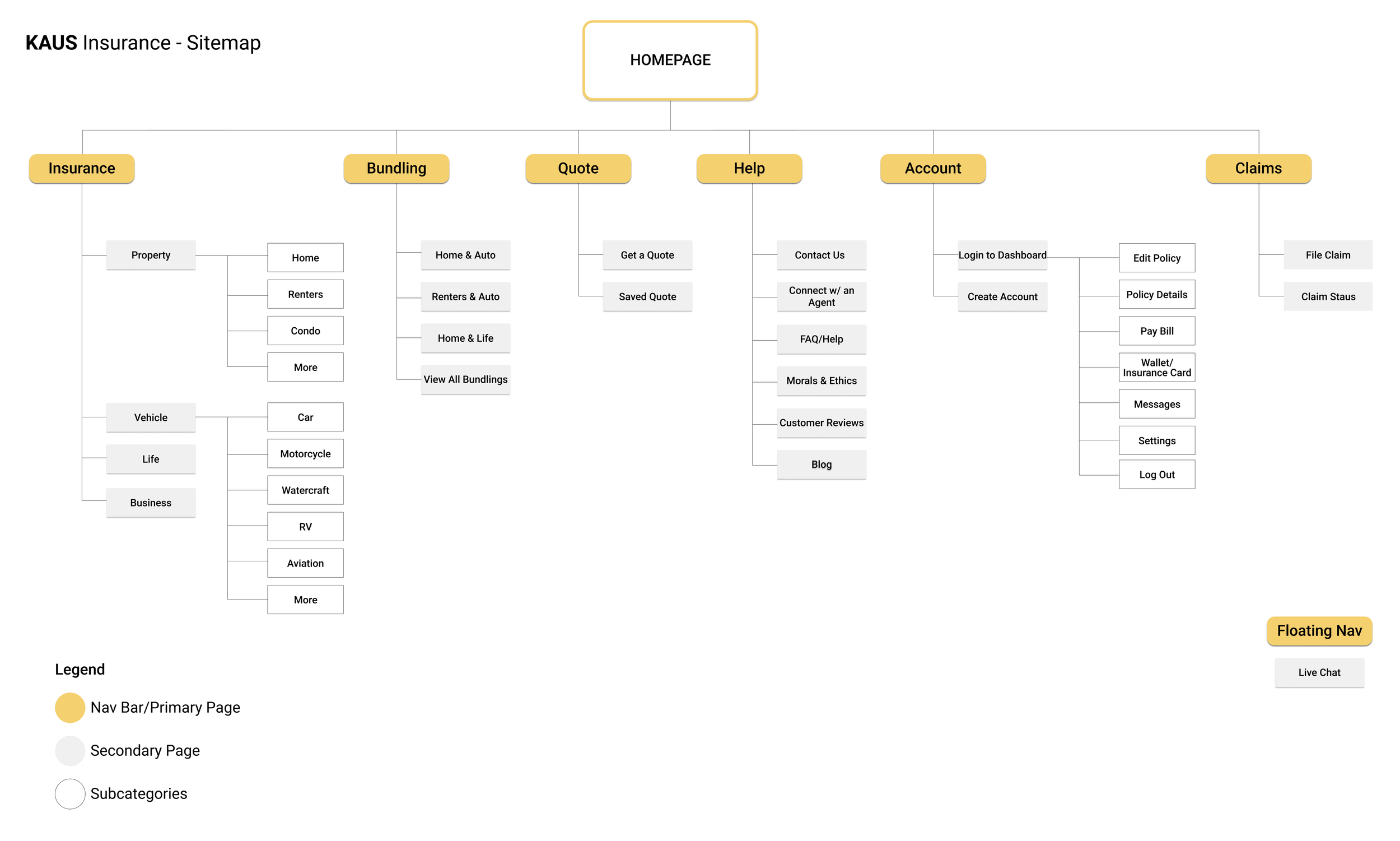
Navigation and access to information was an important aspect that was driving this design. Having done earlier research on global navigation this was the first step. It would represent the map of the site, which, I intended for the users to use throughout their experience. It could always be their home base and a place to go back to.
It was important to have a minimal Global Navigation to not overload the user so the least amount of categories was used with a drop-down menu for the subcategories.
The dropdown allowed the user to see the entire navigation system at a high level to create autonomy and minimal possibility for error.
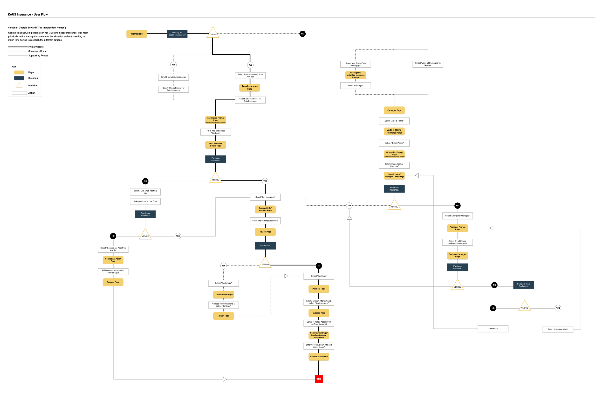
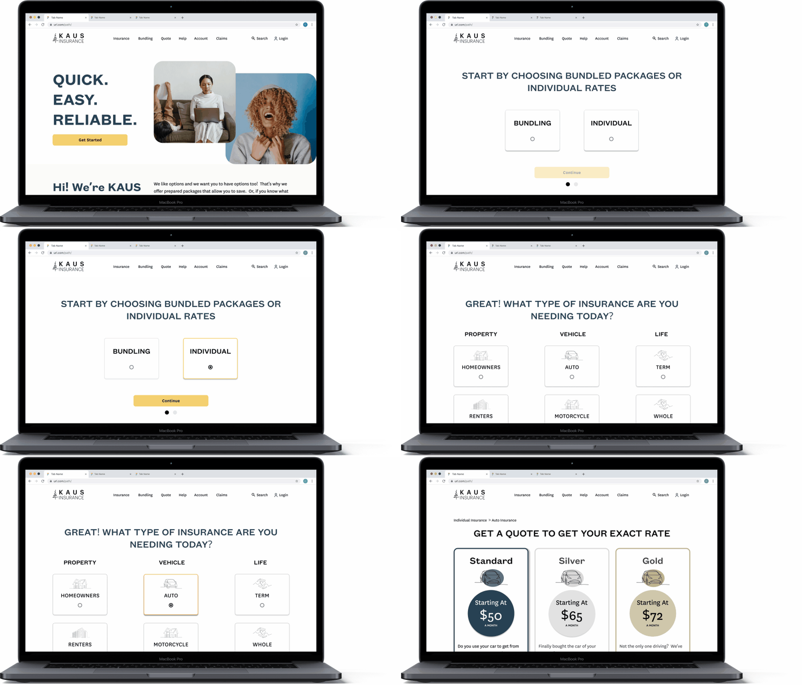
Mapping out flows so users can enter minimal information + get accurate quotes.
With transparency being a major paint point, the biggest takeaway was seeing how many times a user was asked to input their information and where that was placed within the flow.
The goal was to require the users to enter the least amount of information necessary to be able to see accurate starting prices.
03. DESIGN
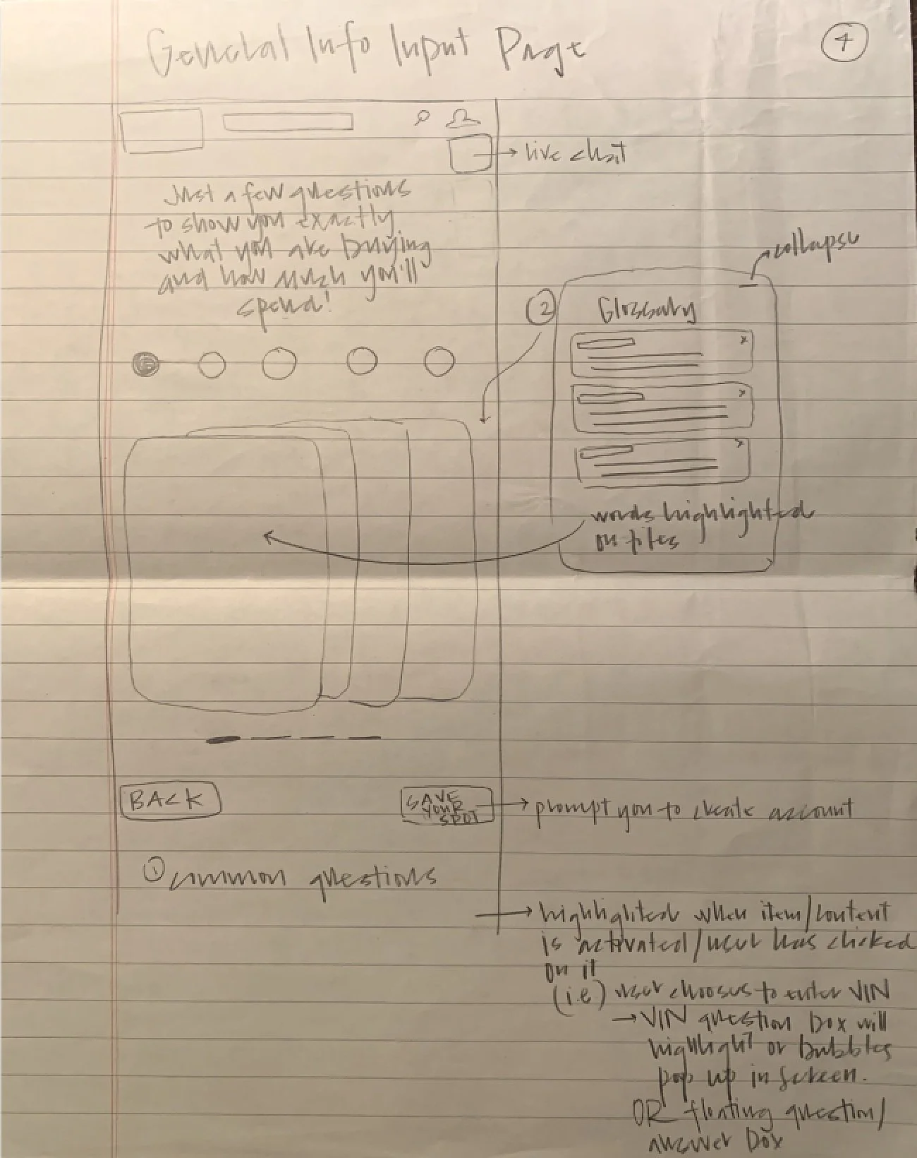
I started sketching.
After learning how users behave, I was able to take that and implement it with design principles and design patterns discovered in the research phase and start creating possible solutions.
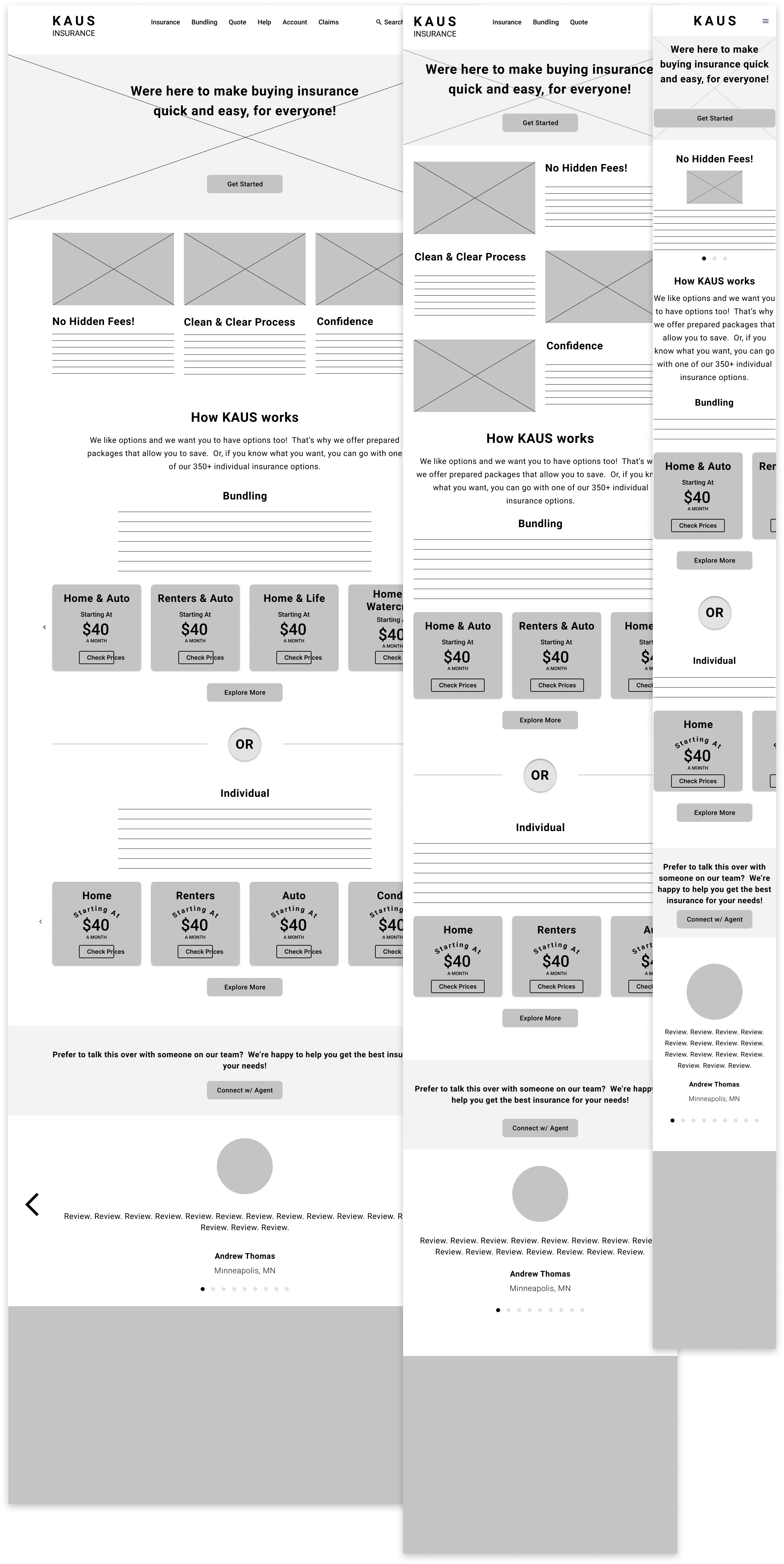
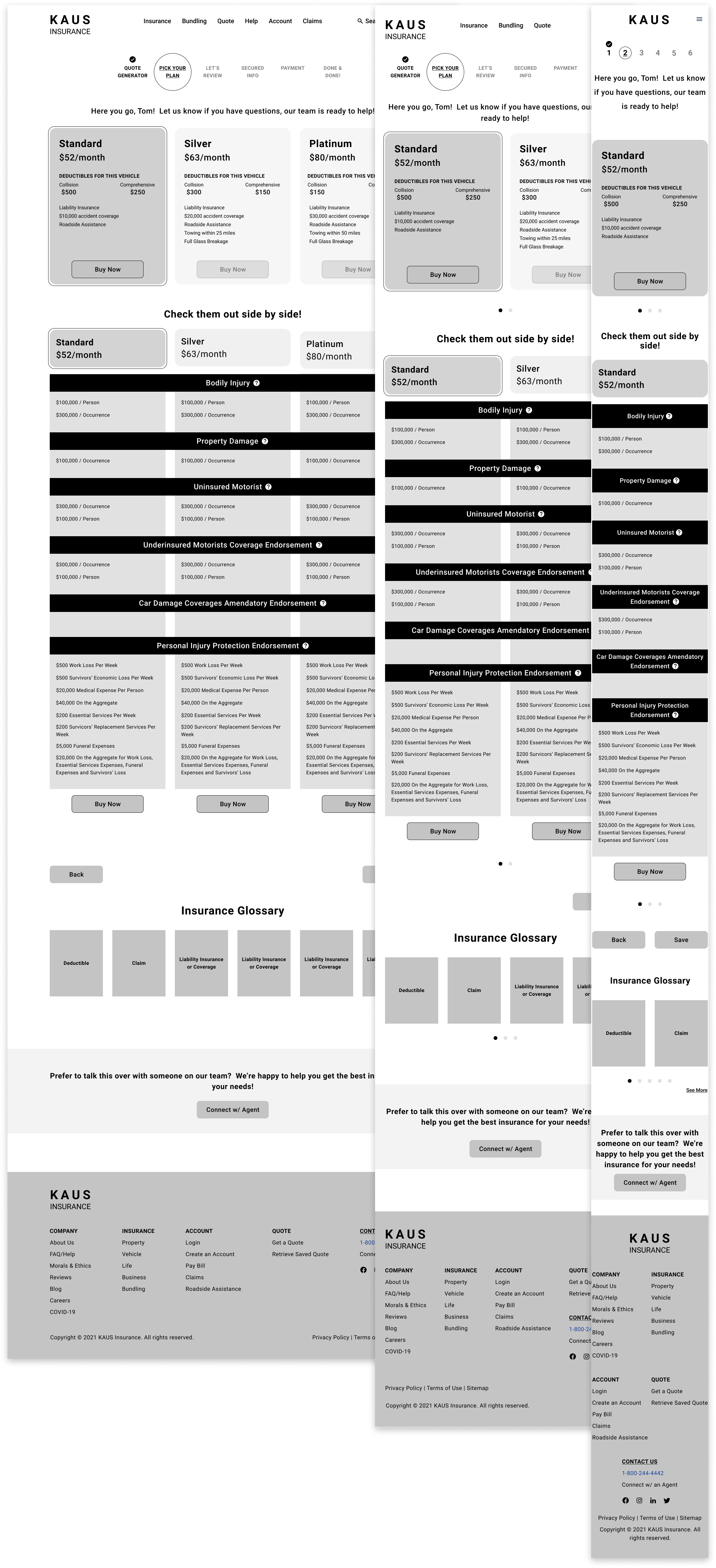
Keeping consistency when creating responsive wireframes. Let’s not change what doesn’t need to be changed.
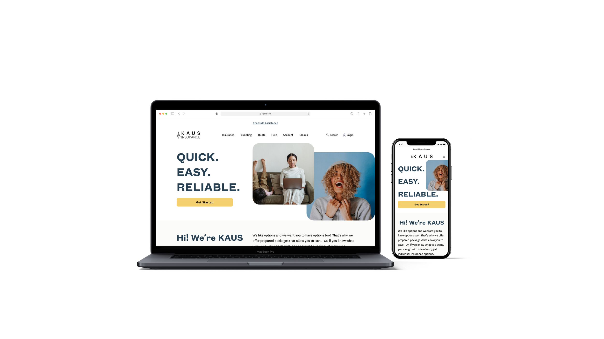
The business requirements asked for a responsive design so breakpoints became crucial to this design. The breakpoints used allowed for limited changes to elements between the different sizes.
All cards stayed the same size between each of the designs - the only change made to them was their layout (either a carousel was implemented or elements were shifted on top of each other).
Font sizes, specifically headers, had to be changed throughout.
Consistency is important in this design since there is already a large amount of information needed to digest. Keeping the font sizes as consistent as possible was intentional to lessen the cognitive load.
Breakpoints:
Mobile: 767px max | Tablet: 768px - 1023px | Desktop: 1024px minimum
**Reflection
Being that this was my first “real” UX design project, I made a point to leave in the flaws I made the first time around as learning reminders. In the mobile version of this wireframe, there are obviously some serious usability issues in the footer (as well as other margin/padding issues throughout). That was eventually changed but I wanted to keep it in to continuously remind myself of pieces of the process that are now second nature to me but at one point were overshadowed by insecurities in the design field as a whole. I want to remember these errors so I can continue to grow from them and remind myself to go with my instinct.
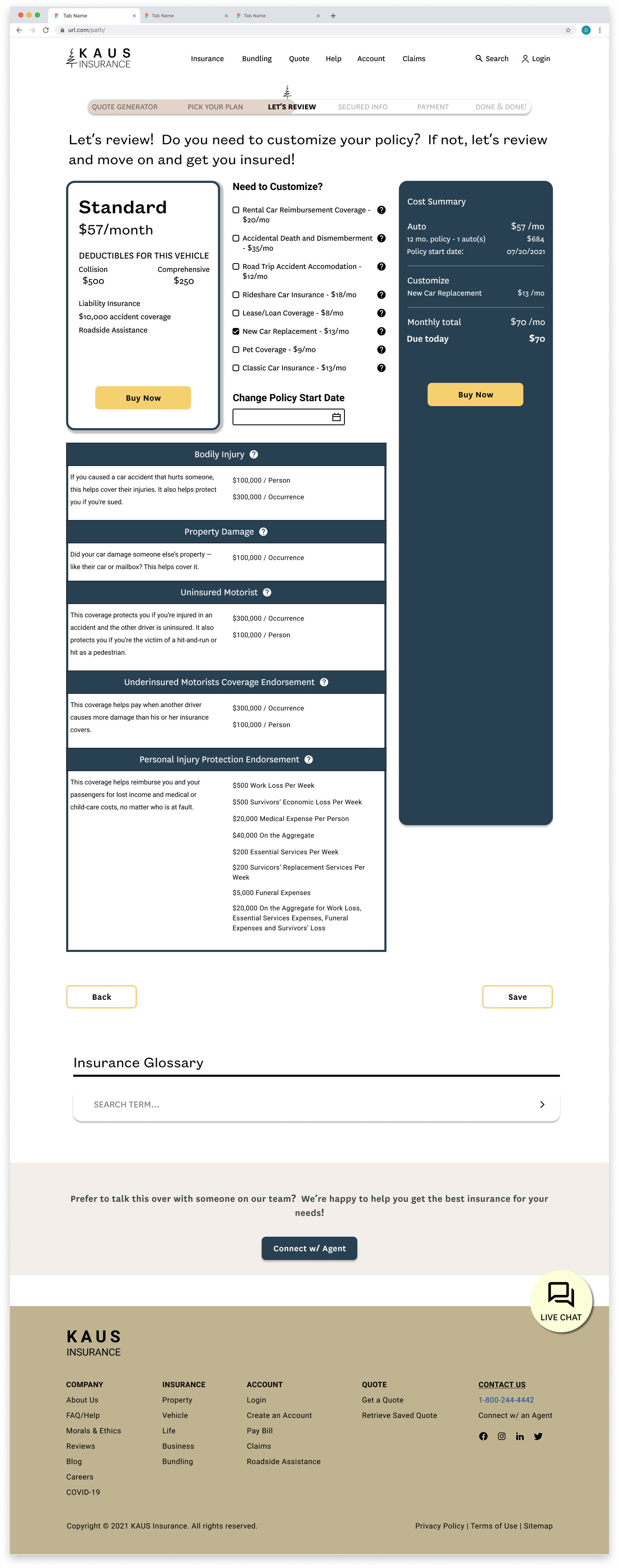
Establishing a confident identity.
KAUS is a trustworthy and transparent company that strives to have simplicity and support at the forefront. They want their customers to feel confident throughout the entire process.
Blue was the primary color used to evoke feelings of trust and confidence.
Orange was used as the secondary color to add an element of playfulness, youth, and vibrance to appeal to the younger market they are trying to connect with.
04. DELIVER
The first go around.
The belief was that if the design was simple + transparent users will have a better experience.
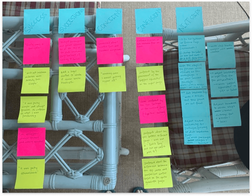
Are the design decisions that were made actually solving the problem?
The belief was that if the design is simple and guides the user through the process, and information is fully transparent, users will have a better user experience and trust the company more. That’s what was being tested.
“Really easy to navigate!” - User #1
“It was pretty streamlined.” - User #3
“I wish insurance websites were actually this simple.” - User #2
QUESTION: Usability Testing
Is fast and easy good? Finding a more realistic design based on industry standards.
There are annoyances about the insurance process that, unfortunately (no matter how hard I tried) are crucial to the ecosystem.
I did additional market research and spoke with people who had a better understanding of the industry and first things first - you NEED to know a zip code to be able to give or receive any sort of accurate rate.
TAKEAWAY: Additional Research
Creating a balanced design.
After taking a step back and testing the design I realized there was a strong imbalance of the user’s needs vs the business needs.
Making a User-Centered design realistic within its space was achieved by adding more priority to the business needs.
ADDING A MODAL.
Before
After
Adding the zip code modal was crucial from a business standpoint for scalability and to make sure users stay on the site by being transparent with accurate information.
Although modals can feel invasive, the idea was to get the information needed to give accurate information later on.
KEEPING IT TRANSPARENT AND FOCUSED.
Before
After
Transparency was the top priority for users - starting rates on the homepage were kept because of that. The Modal allows for those to be accurate.
Through additional feedback and testing I found that the CTAs were competing against each other so removed them and made the card clickable. Less cognitive load is required from the user.
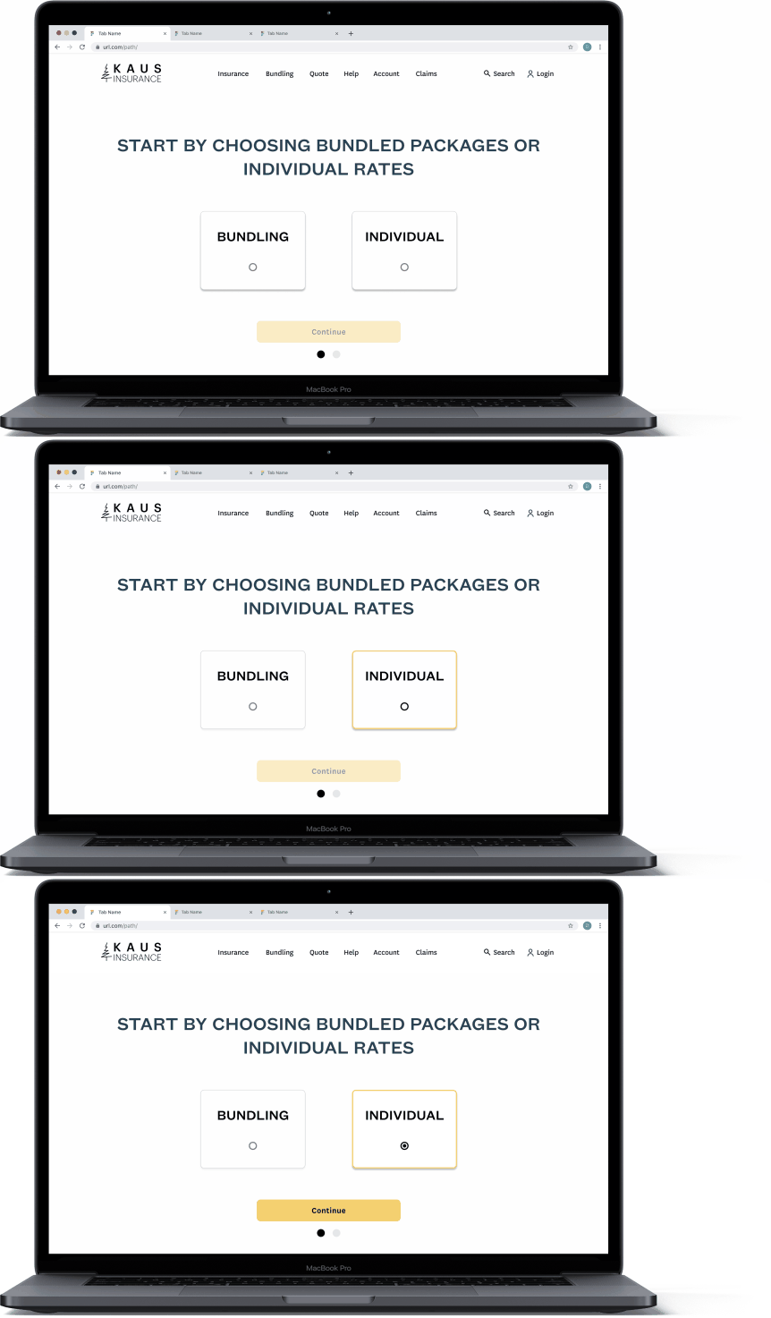
MICROINTERACTIONS.
I knew I would need to keep some elements in the design that users had expressed as pain points in the user interviews to keep the design realistic.
I included microinteractions to take away from those annoyances and to reassure the user by guiding them through the process as well as making the process more enjoyable and fun.
ADDING TO THE FLOW FOR A REALISTIC DESIGN.
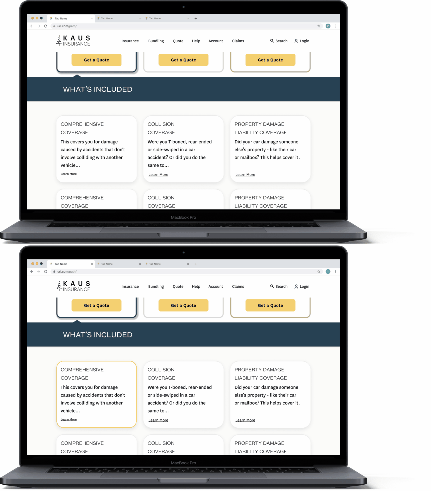
When going back through the design with the question “Is this a realistic design?” in my mind, I realized that the design didn’t offer a page for users to browse all policies, which was in the business requirements, so I felt additional pages were needed.
Next Steps
Test the modal on the front page to see if users have a negative experience with it, and if they do, come up with a new solution for retrieving a zip code from users.
Build a user flow for a more complex insurance policy (i.e. a bundle, life, etc.) and see if the design is scalable.
Test the “Get Started” CTA user flow to find any point points and get feedback on the new pages.
Test the current flow with participants that work in the insurance industry and find out if the flow and design are accurate for solving the problem at hand.
Determine what success looks like to the business and implement the design to measure that to see if the design is successful.
Insights. There were a lot of them.
01. I learned the importance of understanding the industry in which the product will live. My process could have still been user-centered but much more efficient and streamlined if I would have had the business needs and standards at the backbone of my research. In my next work, cultivating a balance of user needs and business will be my focus from the start.
02. Getting rid of something does not solve it - some elements are necessary for products and figuring out how to listen to the user and make those elements more usable is what it means to solve the problem. Really understanding what the business is asking within the context of the industry is something that I will make sure to define at the beginning of future projects.
03. Test often! If I would have tested earlier on in the project I could have uncovered this inconsistency earlier on.
04. I learned a lot about microinteractions while solving this problem and how they can take a design to the next level.


